A modern legal brand
built around access,
clarity and trust.
Legal One was created as a modern gateway to specialized legal expertise. The identity needed to feel credible and professional, while remaining clear, approachable and flexible enough to support different sectors, services and future brand extensions.
the challenge
How do you build a legal brand that feels credible without looking like a traditional law firm? Legal One was created as a modern point of access to specialized legal expertise. Instead of offering generic legal services, the brand connects businesses, organizations and individuals with experts who understand their specific sector, problem and context. The challenge was to create an identity that could communicate trust and professionalism while moving away from the visual conventions of the legal industry. The system also needed to be flexible enough to support multiple areas of expertise and future sector-specific extensions under one coherent brand.

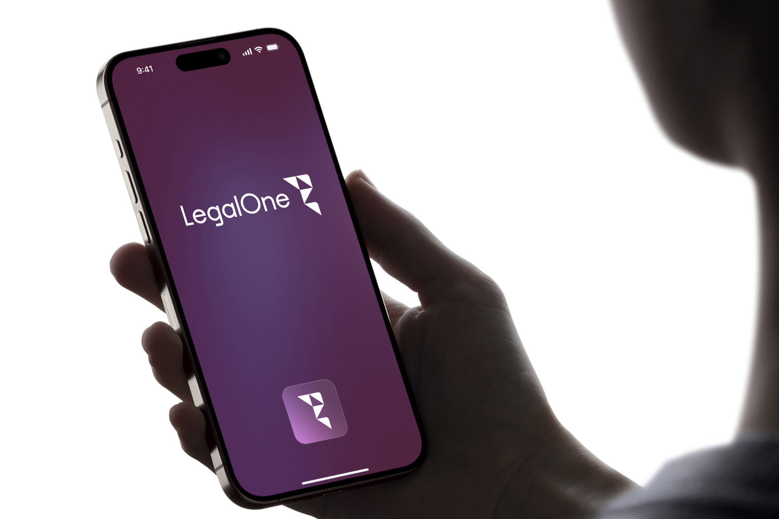

Legal expertise does not have to feel distant or complicated.
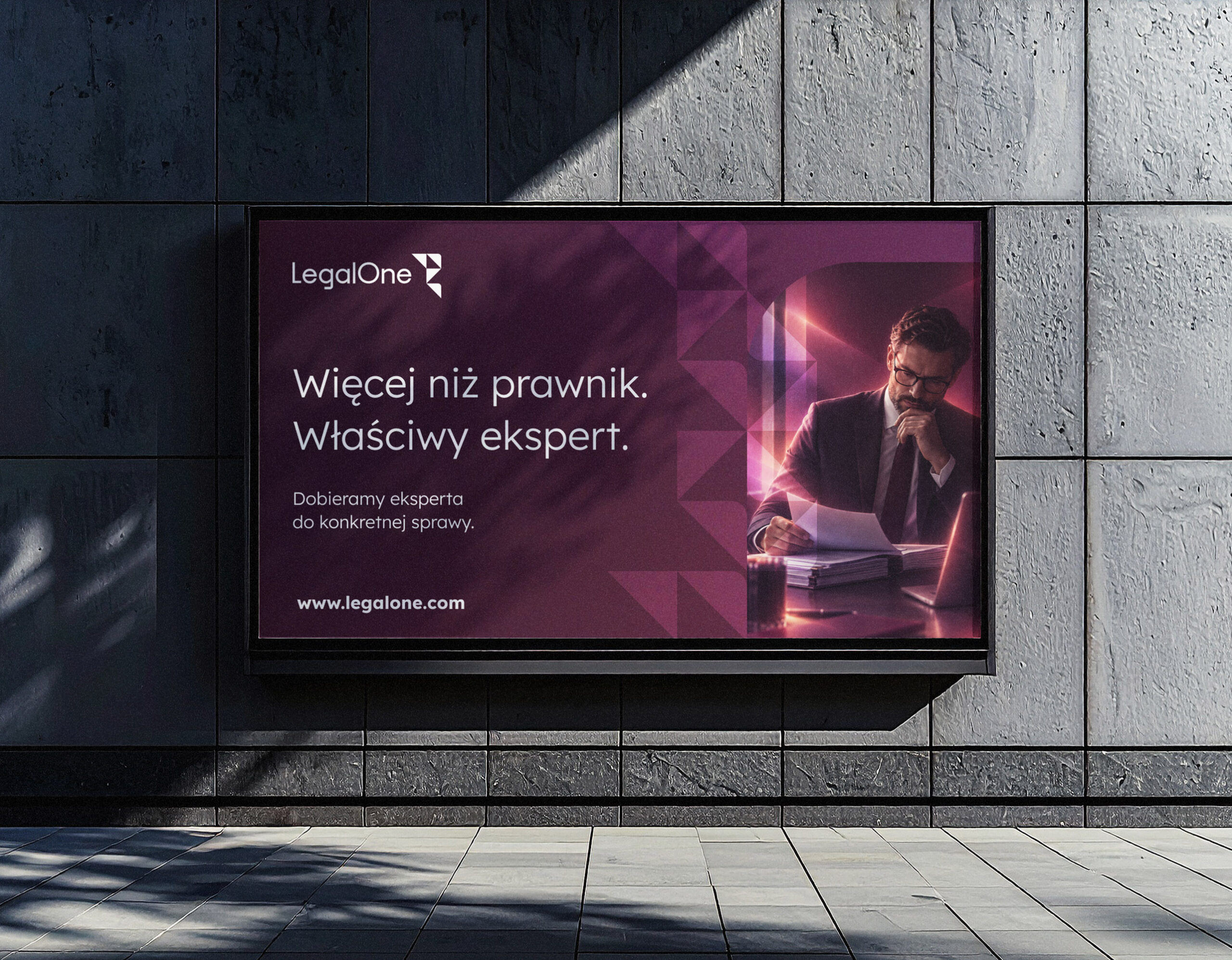
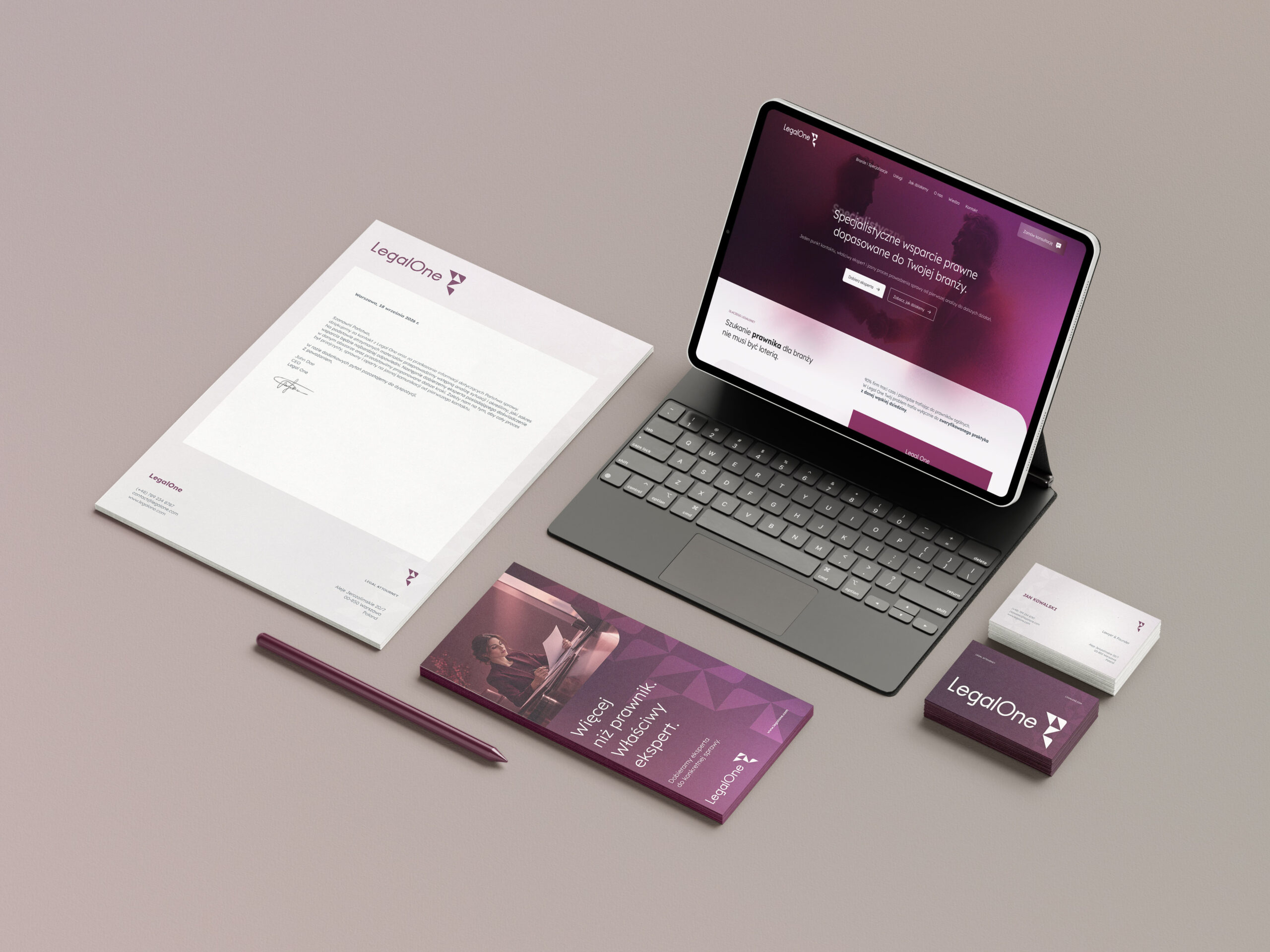
The identity was built around clarity, accessibility and structure. Rather than relying on familiar legal symbols, the visual language uses contemporary typography, a distinctive symbol, modular graphic elements and a flexible color system.
The goal was to make Legal One feel like a well-organized partner: expert enough to inspire confidence, but approachable enough to make the first contact easy.
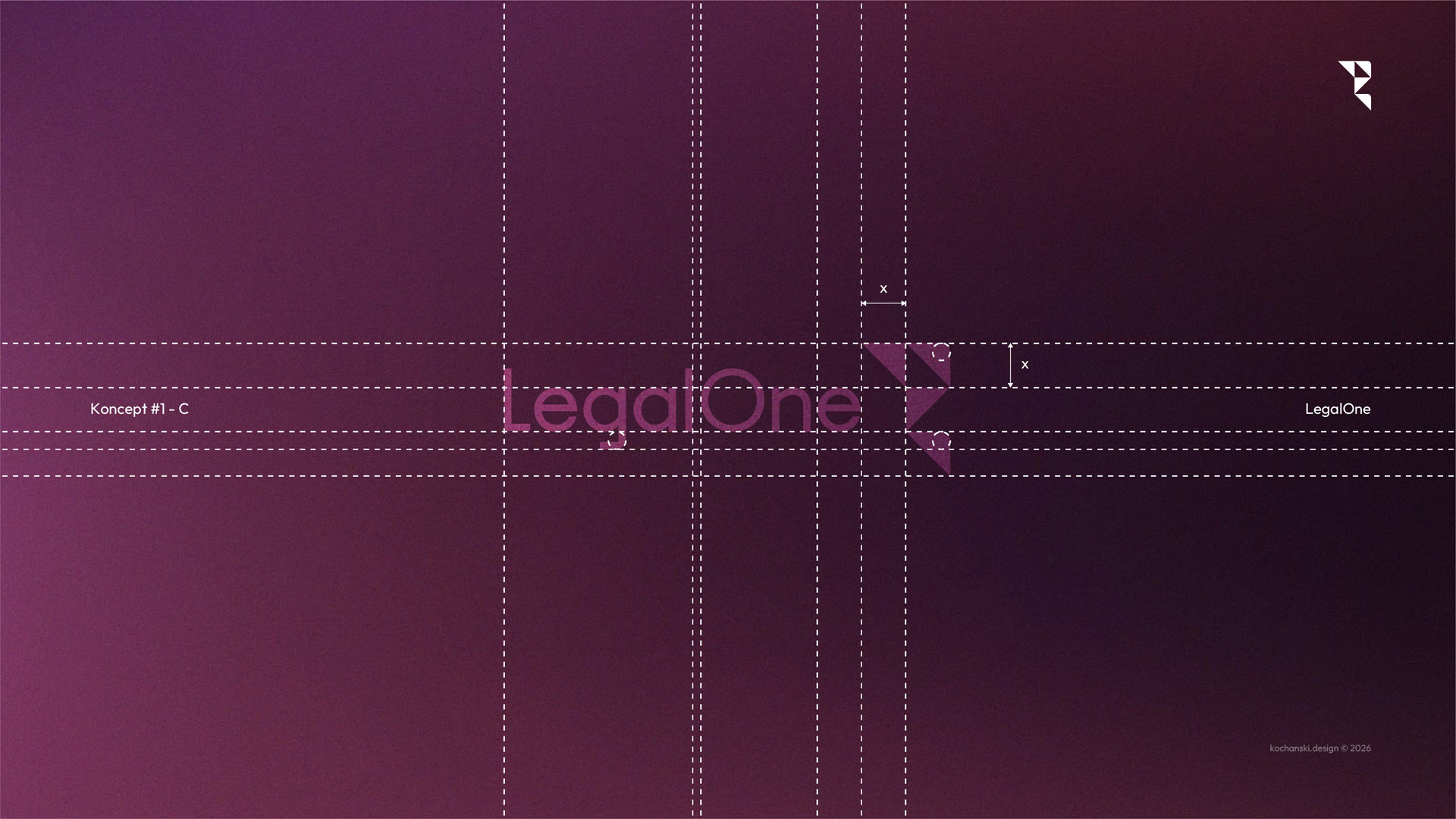
A flexible identity system designed to grow with the brand.
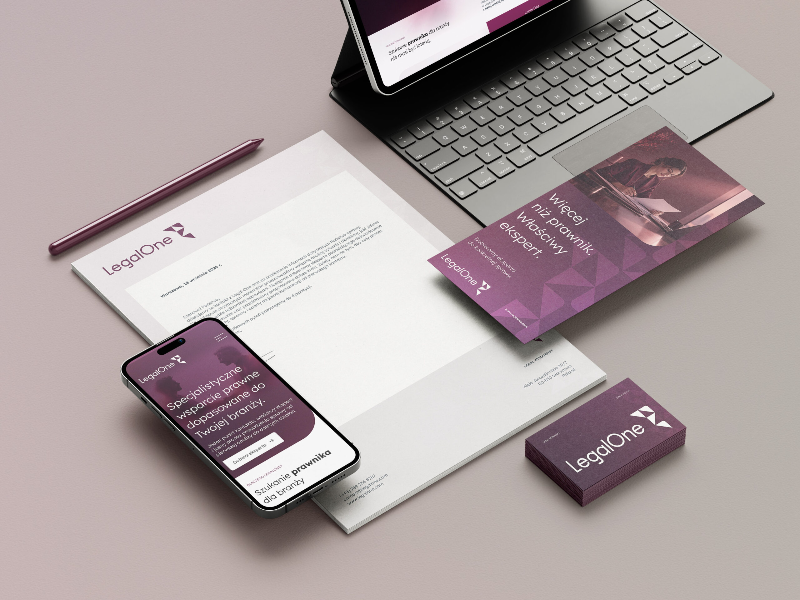
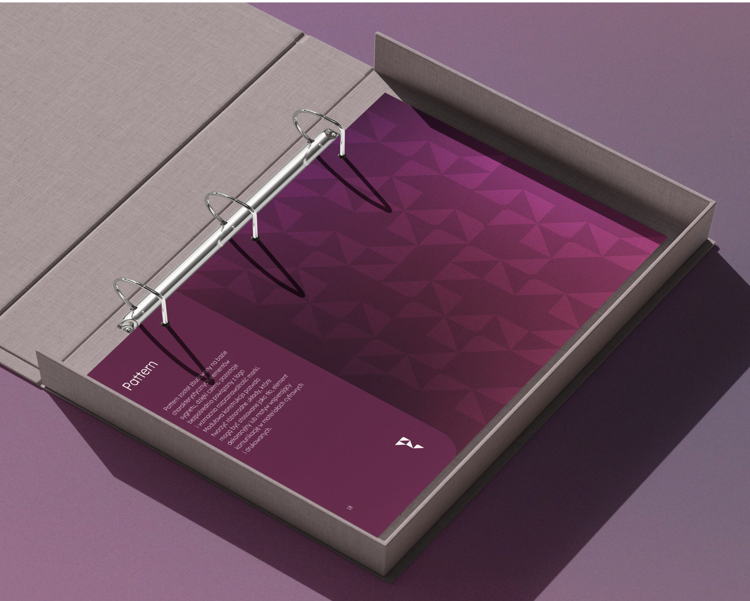
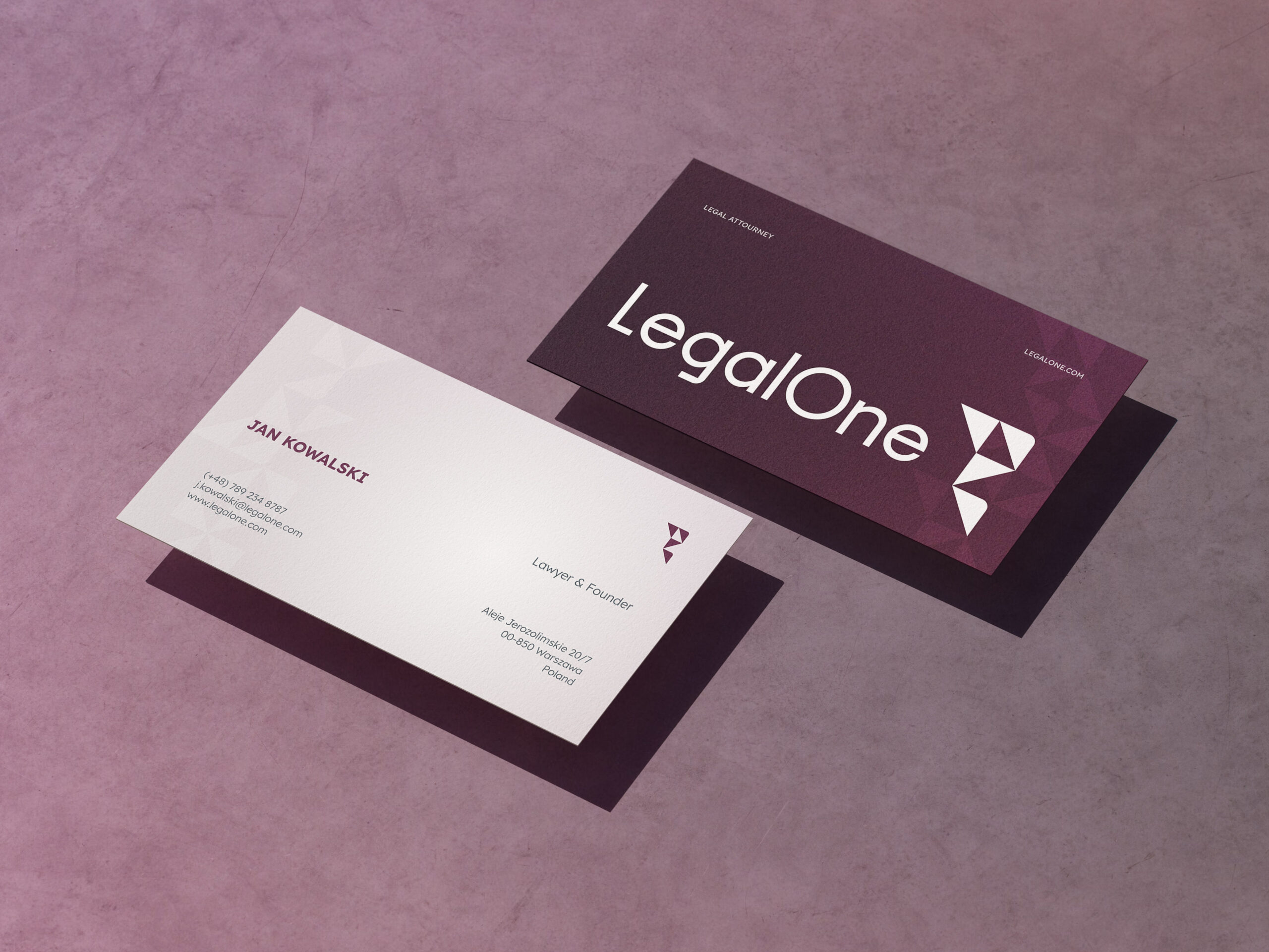
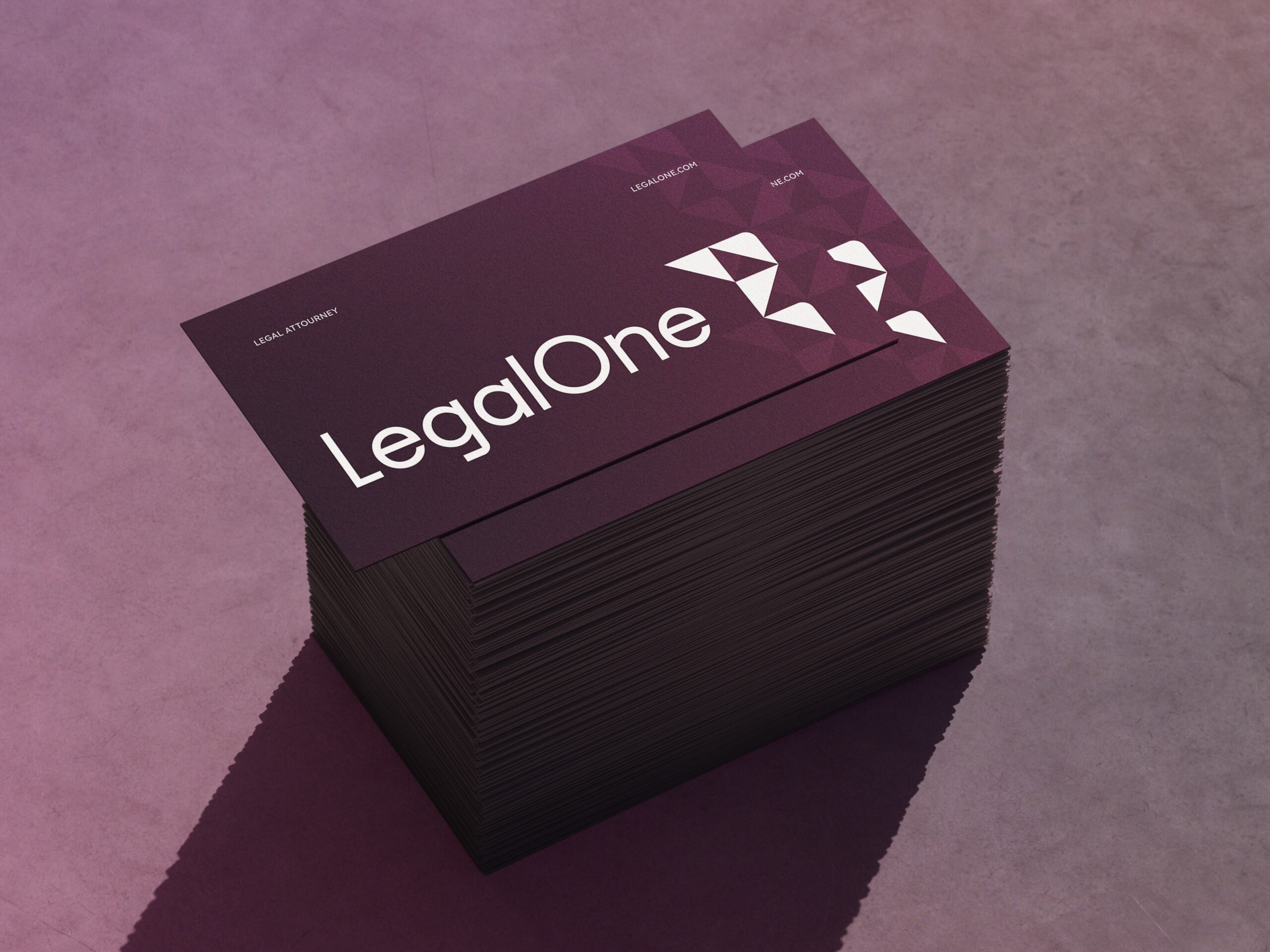
The final system extends beyond the logo. The symbol became the foundation for a custom pattern, the color palette introduced a warmer and more distinctive alternative to traditional legal branding, and Lexend typography reinforced clarity across digital and print communication.
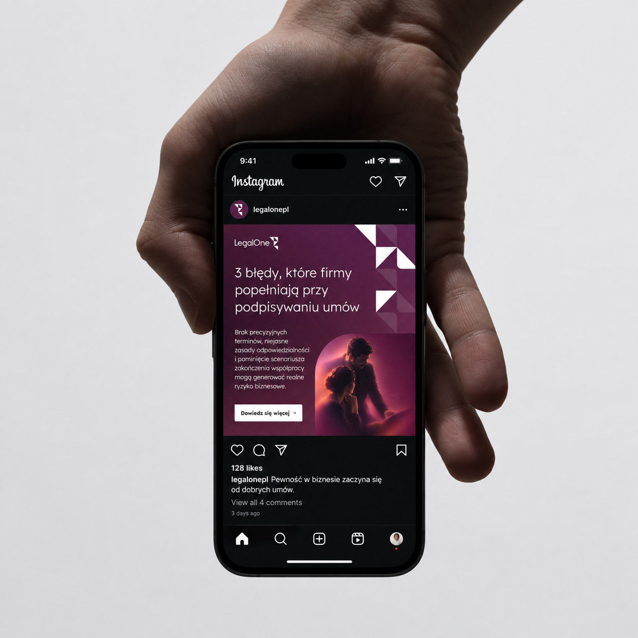
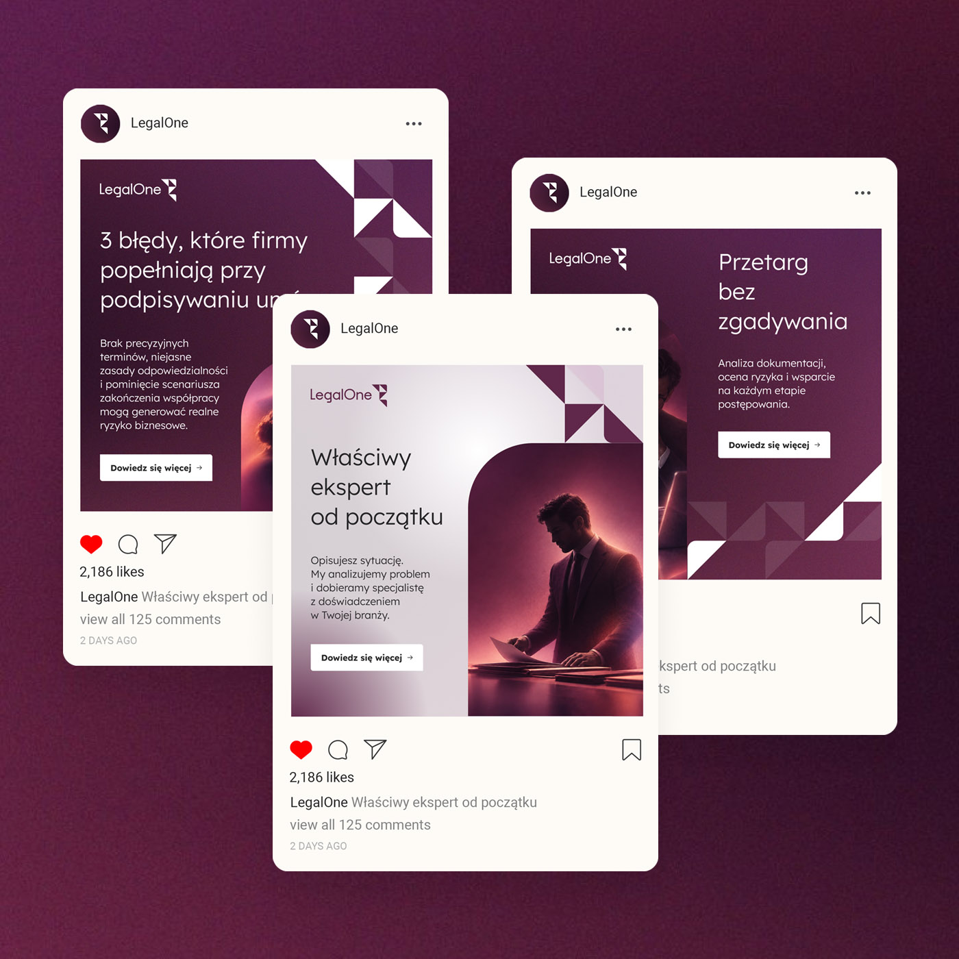
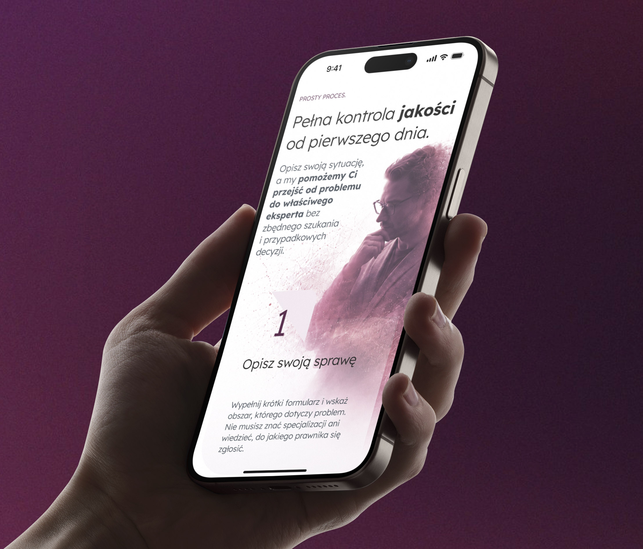
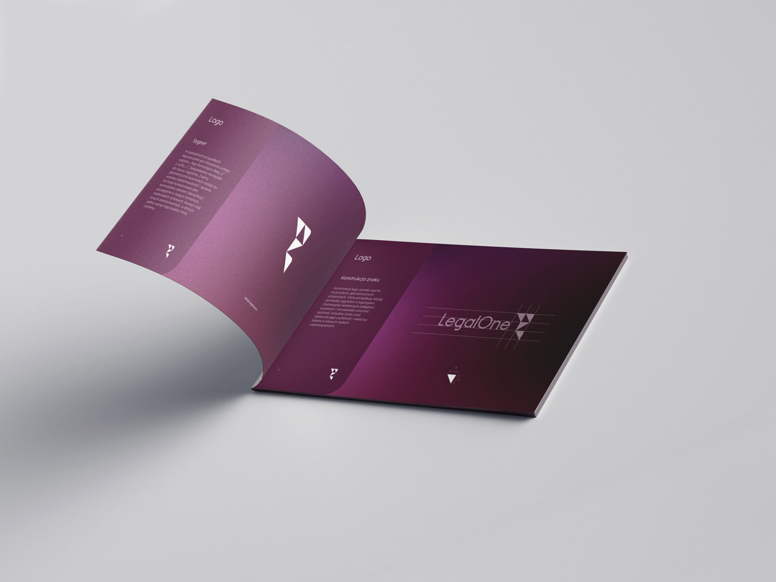
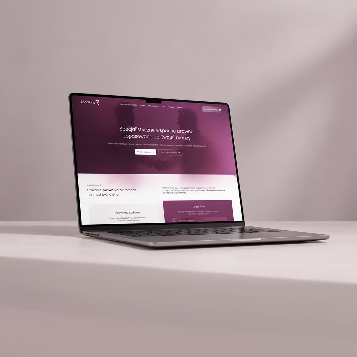
The identity was then translated into a responsive homepage, social media templates and a complete set of brand guidelines, creating one consistent visual language across every client touchpoint.