Building a new
residential brand
for Nowa Huta.
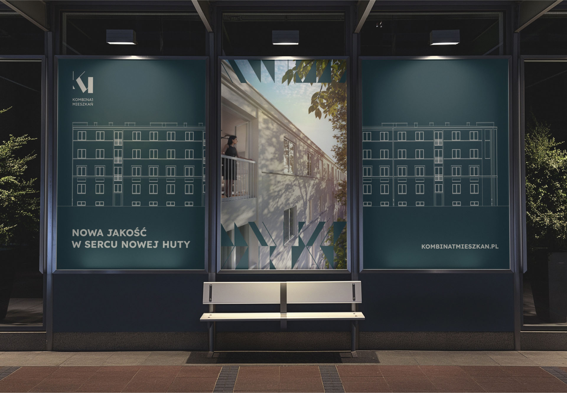
Kombinat Mieszkań is a residential development located in Nowa Huta, Kraków defined by its unique urban history, raw geometry, and strong architectural rhythm.
The challenge
Create a distinct, attractive brand using intentionally "quiet" colors inspired by Nowa Huta’s architectural past without losing modern appeal or market competitiveness.
the client needed:
* a visual identity that felt premium, but not luxurious or loud
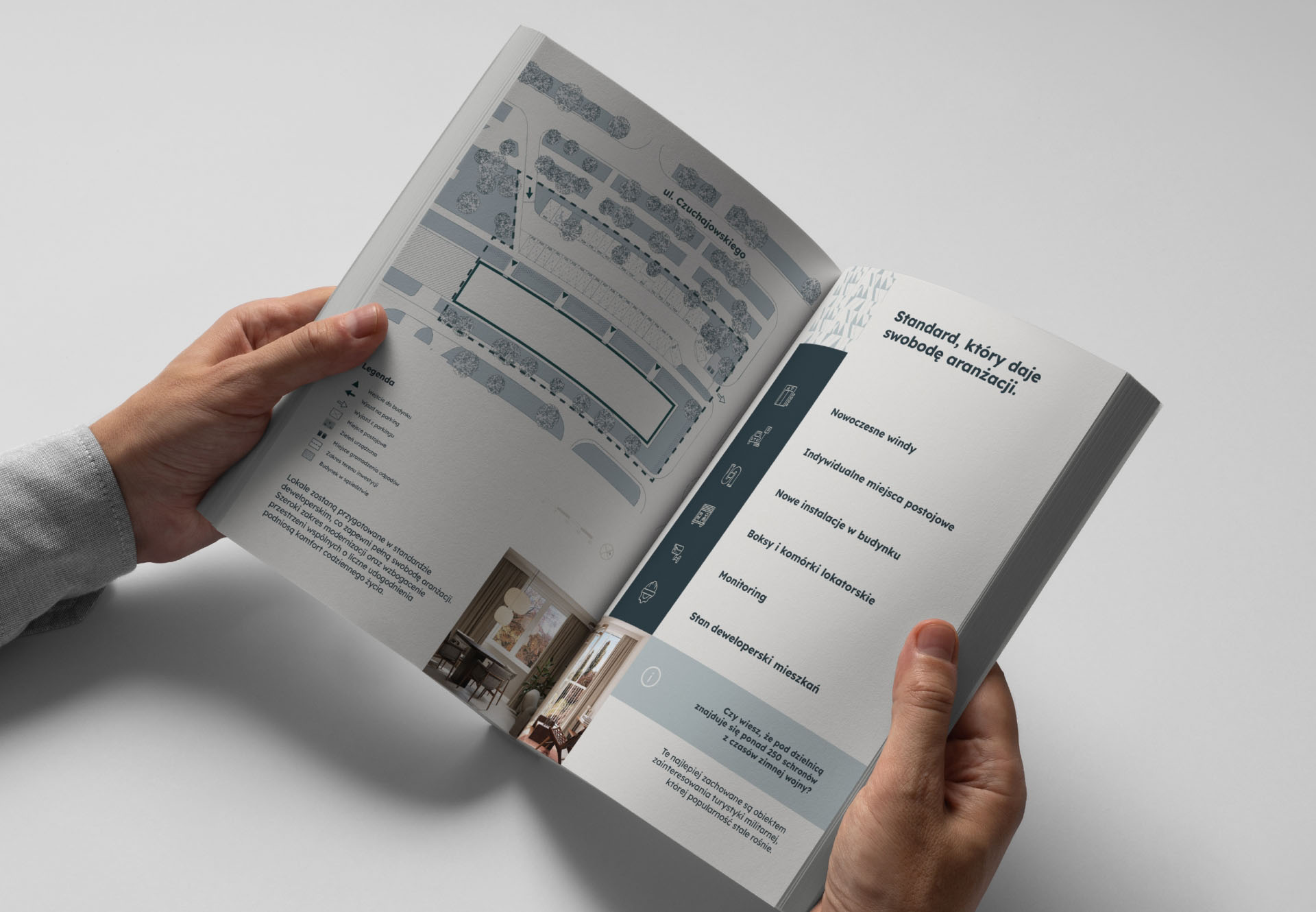
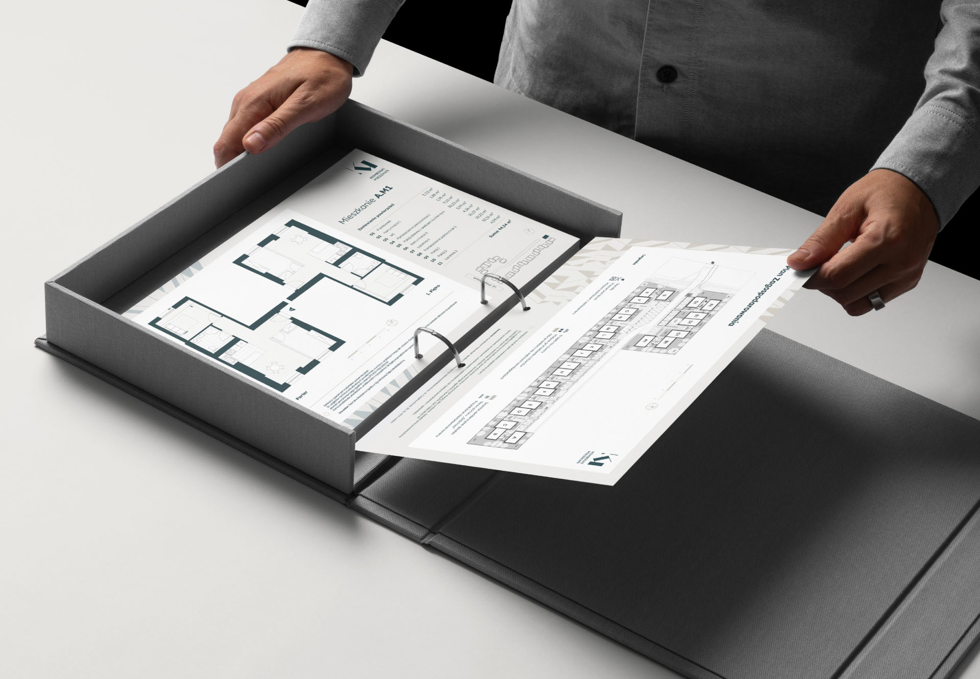
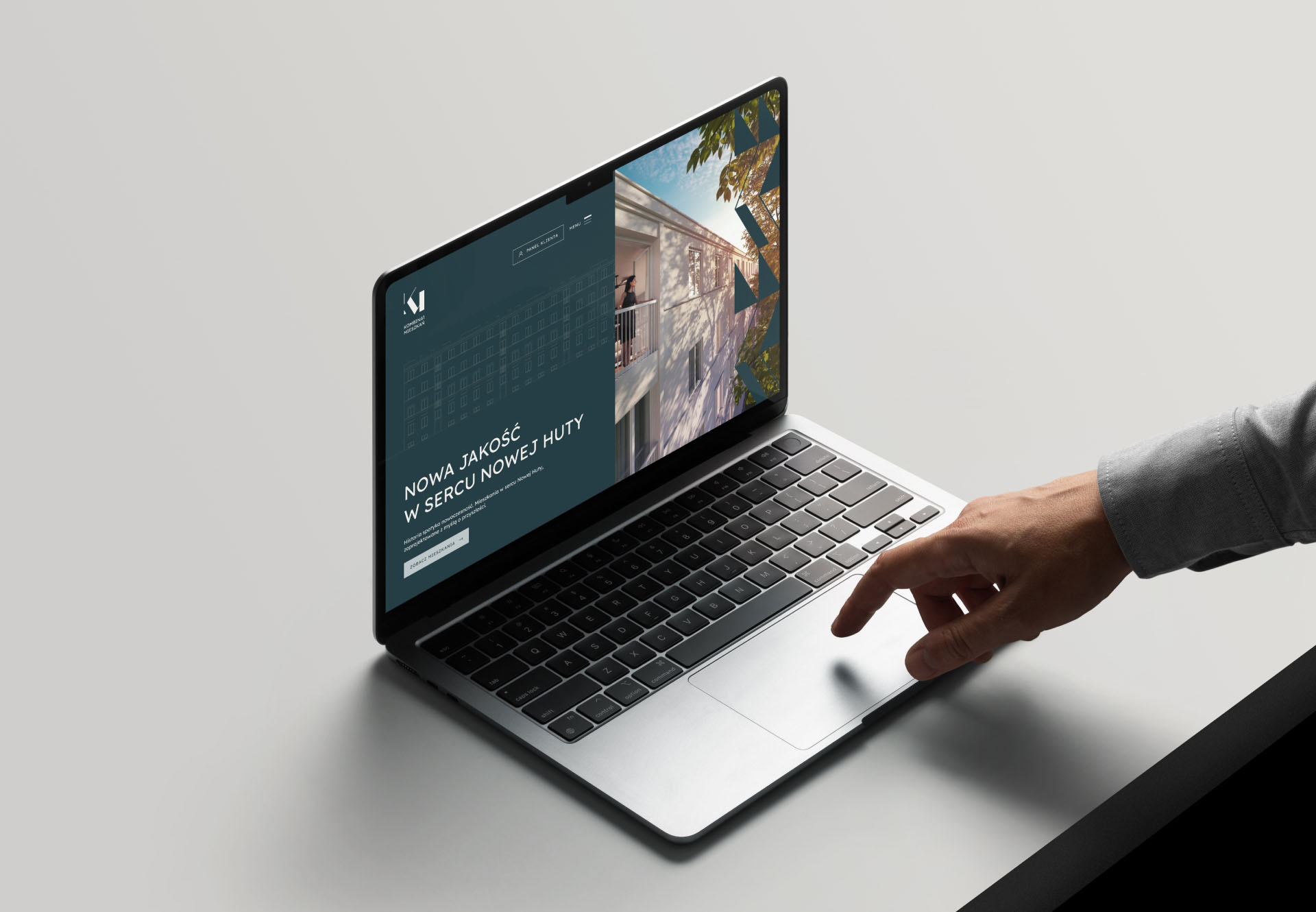
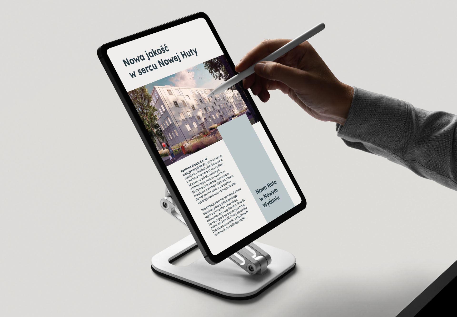
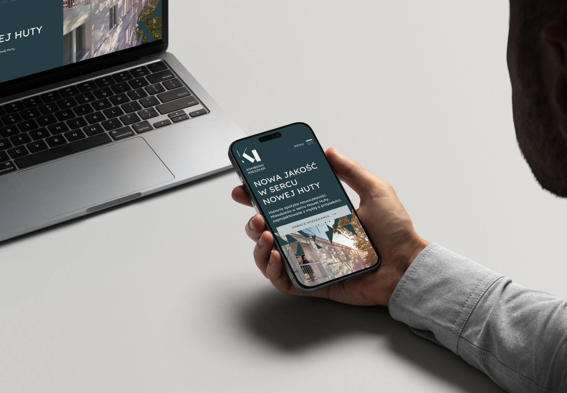
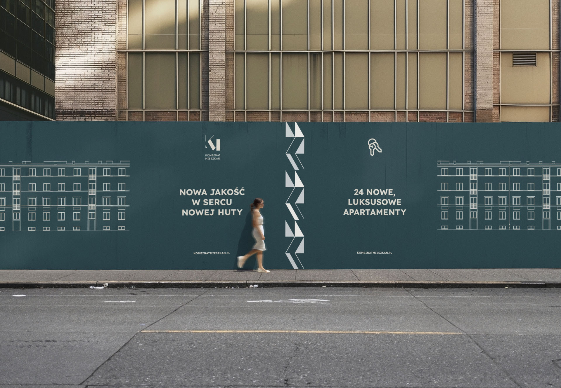
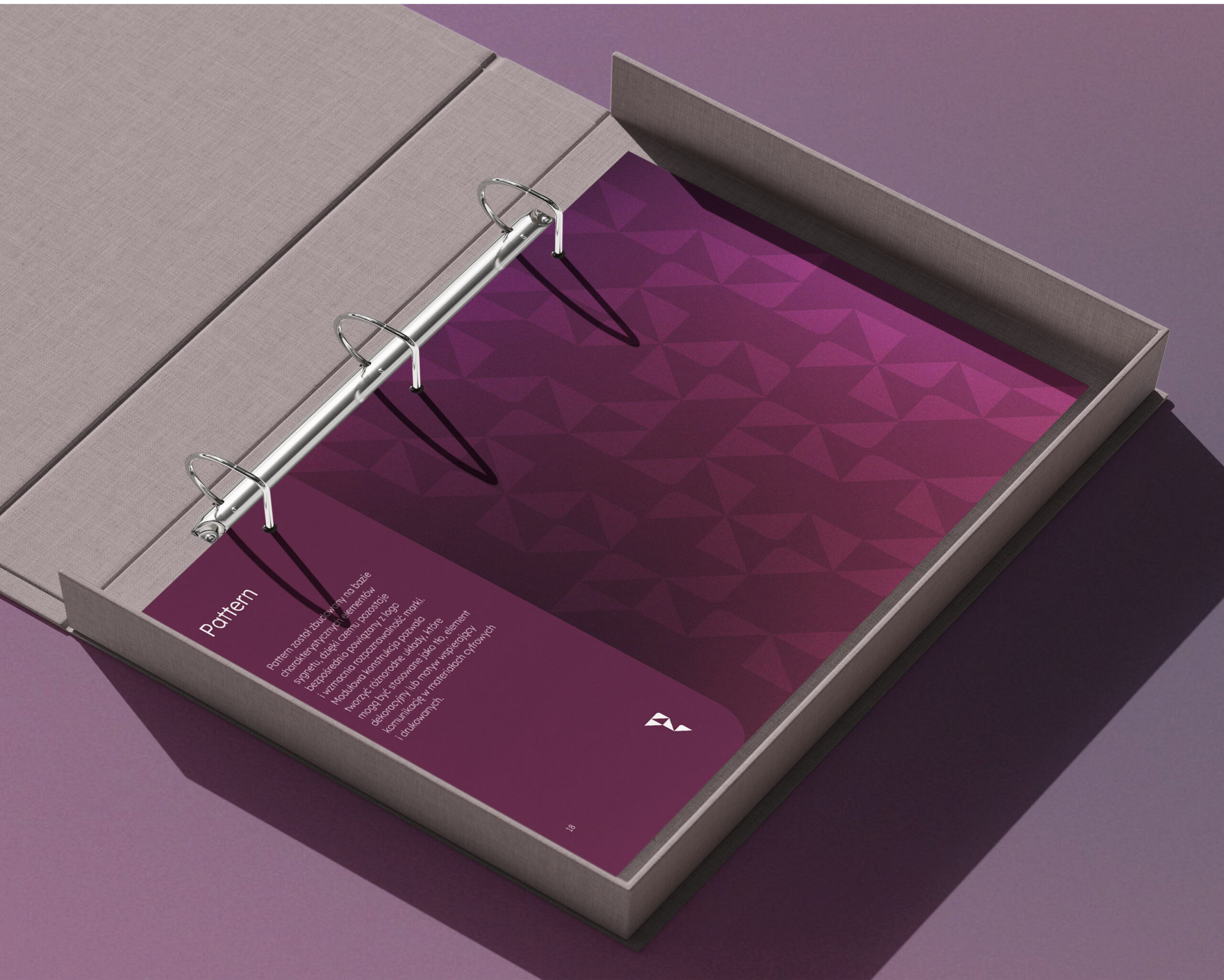
* a system that could live on signage, digital platforms, and print
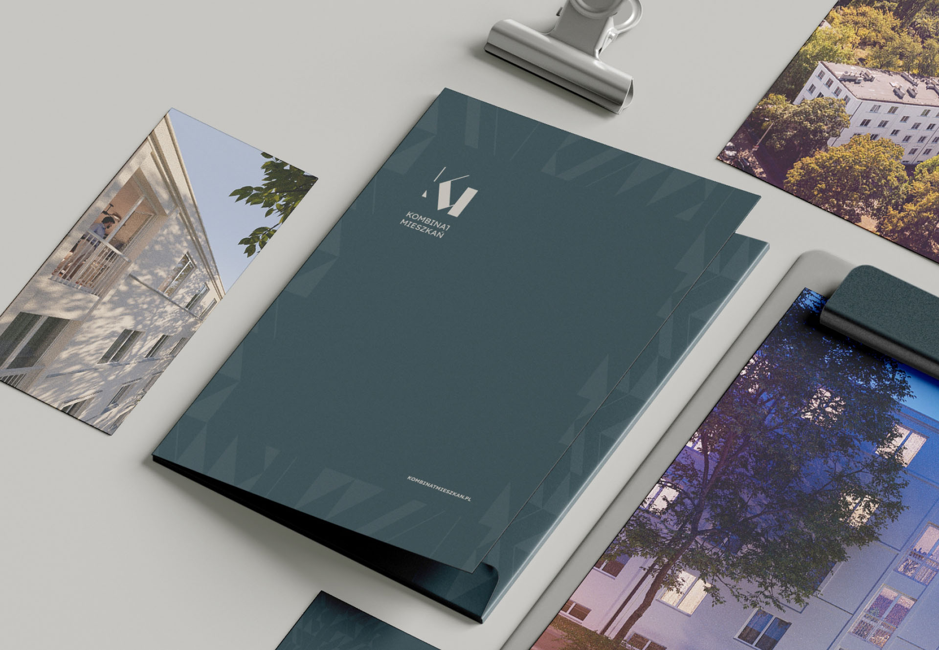
* a palette that referenced Nowa Huta’s muted, industrial elegance
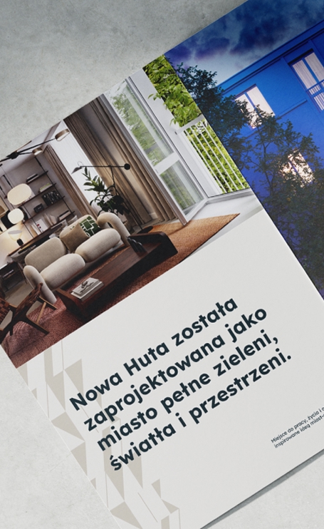
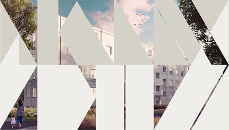
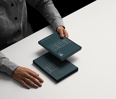
“The brand shouldn’t compete with the environment
but it should harmonize with it.”
I started by analyzing Nowa Huta’s visual DNA:
* geometric grid of the district
* concrete tones
* soft, desaturated color environments
* repeating architectural rhythm
* quiet, structured emotional atmosphere
Using that, I built a direction based on:
* color greys + soft natural neutrals
* architectural balance
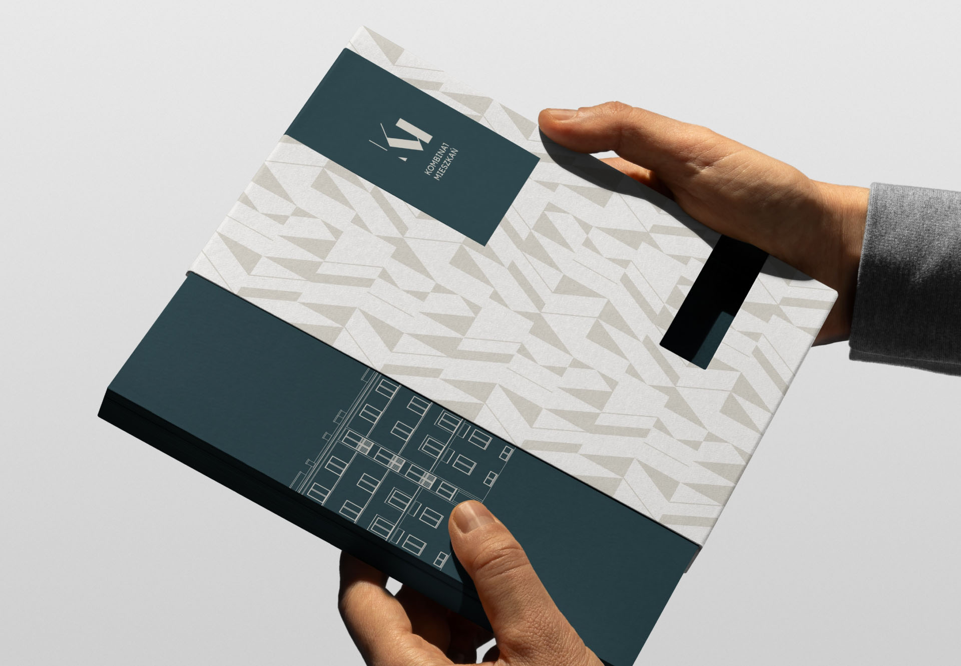
* rhythmic layout structures
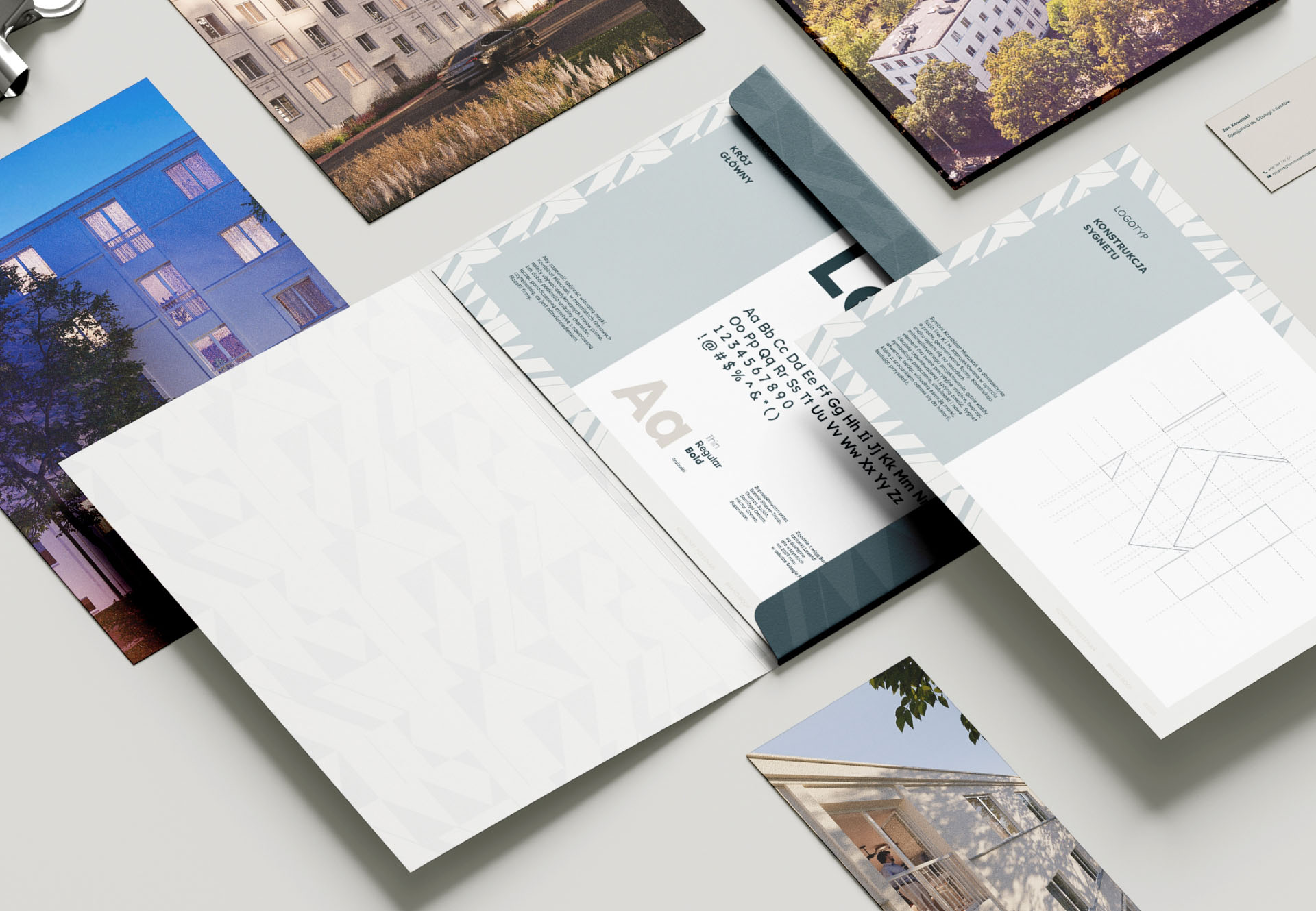
* clean typography with strong geometry
* AI-assisted exploration of color harmonies and facade-inspired patterns
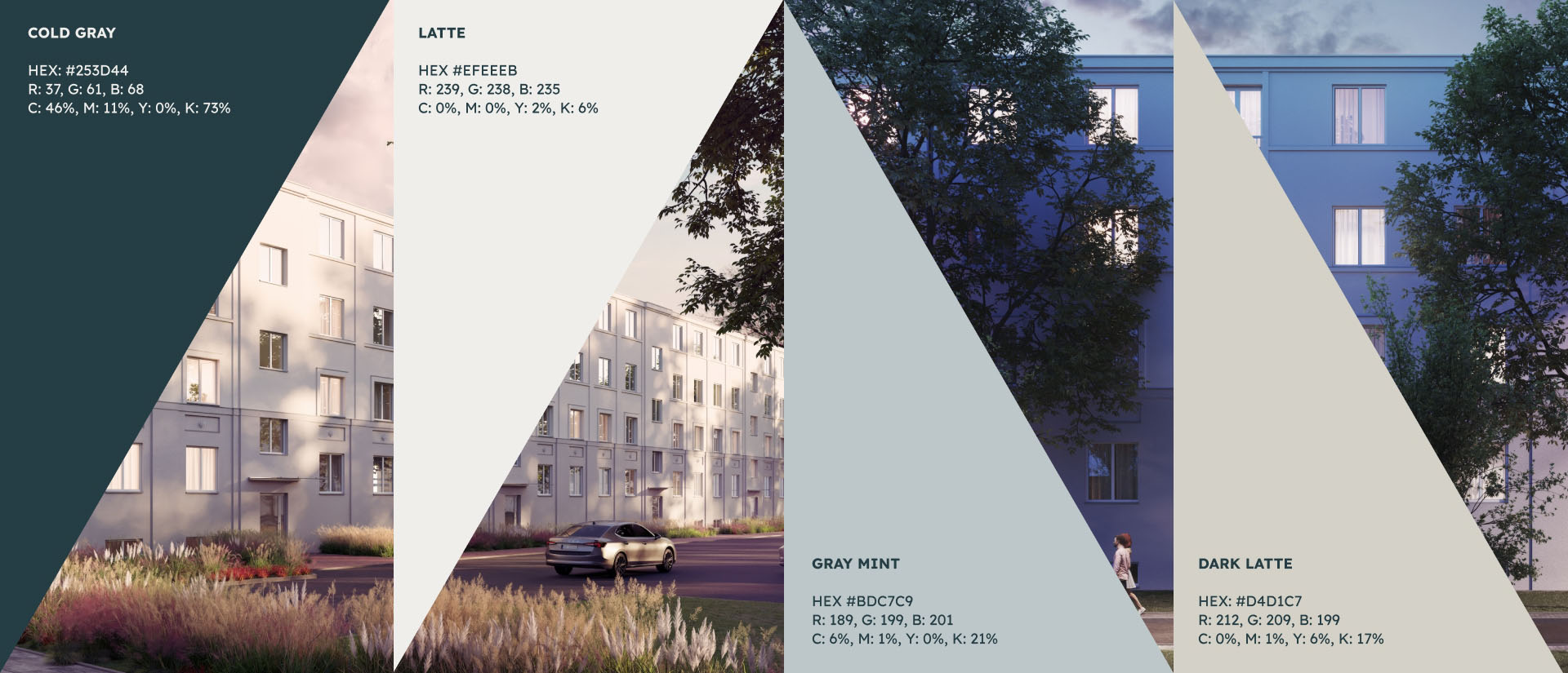
The final identity blends modern clarity with a quiet architectural character.
Key elements include:
* muted, heritage-inspired color palette referencing concrete, stone, and natural patinas
* strong geometric typography for stability and trustminimalist grid system echoing the architectural blocks of Nowa Huta
* soft photographic direction with human warmth and natural light
* signage pattern grounded in simplicity
The identity feels:
* trustworthy
* structured
* rooted in place
* calm and premium
* emotionally subtle