skip to content

Digital experience for premium property investments.

Prime Estates presents high-end residential developments as carefully selected investment opportunities. The website needed to feel credible, refined and premium while making complex property offers easy to explore.

about

Prime Estates connects clients with premium residential developments positioned as long-term investment opportunities.

The website was designed to present selected properties in a way that feels aspirational, but still clear and trustworthy. Each investment needed enough space to communicate its location, character and value without turning the experience into a typical property listing portal. Created in collaboration with webeo.it, the project involved direct communication with the client throughout the design process, including three online meetings used to align expectations, present directions and refine the final experience.
challenge

Building a premium direction from almost nothing.

The project started without an established visual language, prepared assets or a clear creative direction from the client.
That meant the look and feel of the website had to be defined from the ground up. I researched the premium real estate market, reviewed competing brands and identified the visual patterns that made the strongest projects feel credible, modern and high-end.
The challenge was not simply to make the website look luxurious. It was to create a visual system that could make very different developments feel like part of one curated Prime Estates offer. With very little visual guidance at the start, the early client conversations became an important part of defining the direction. Rather than working from an existing brand system, I had to translate broad expectations around premium real estate into a coherent visual language.

solution

A restrained system that lets the properties do the talking.

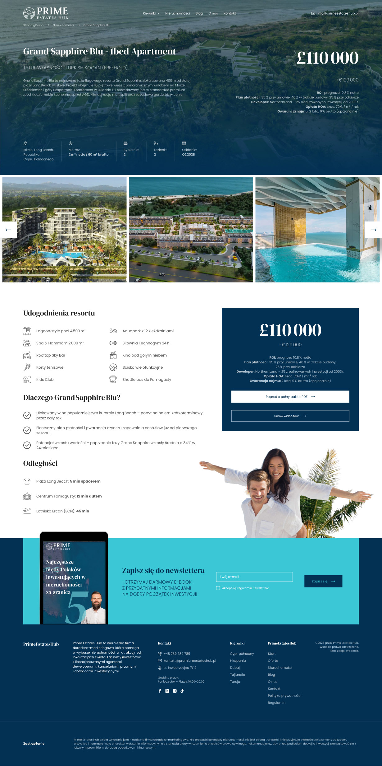
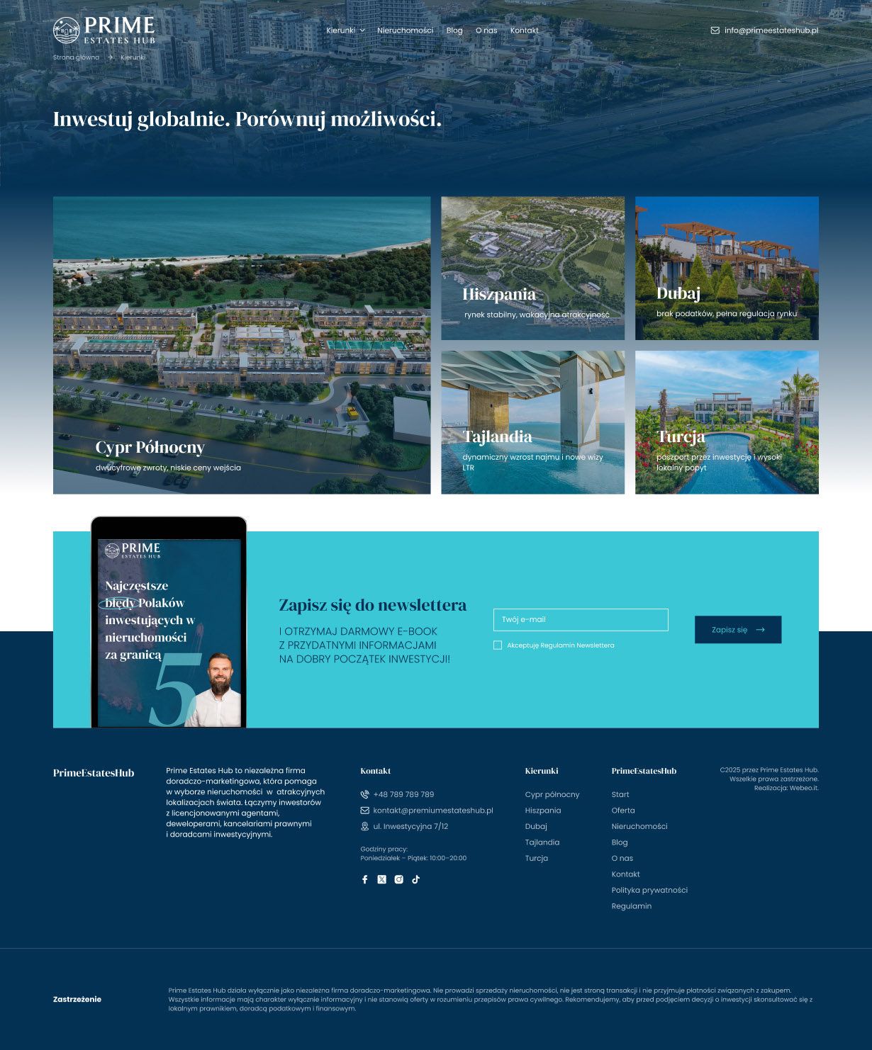
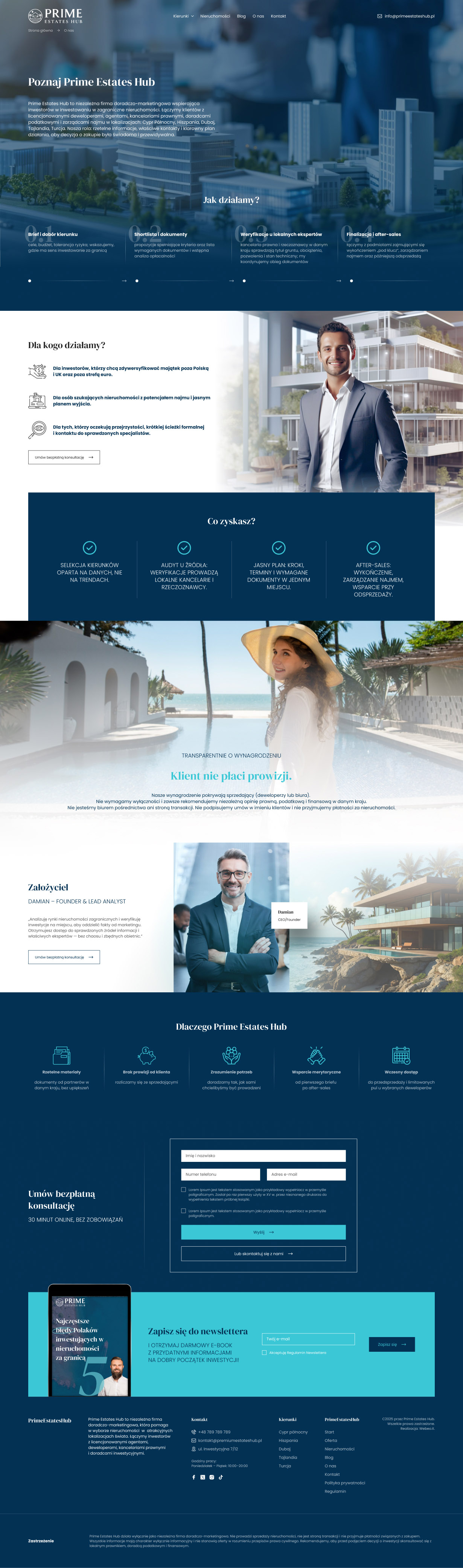
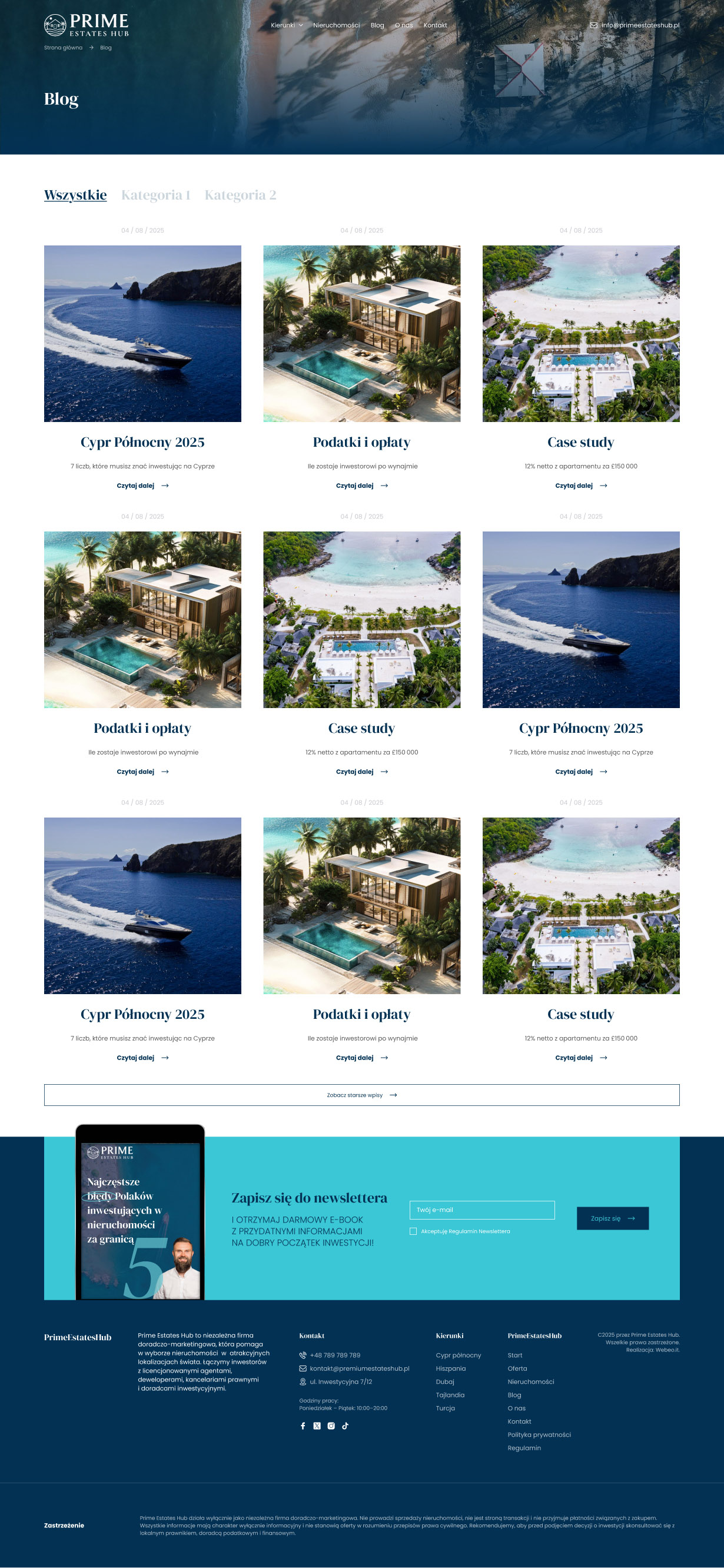
I created the complete digital direction around strong typography, generous spacing, large-scale imagery and a deliberately minimal interface.
The visual hierarchy was designed to make each development feel important while keeping the overall experience consistent. Instead of adding decorative luxury cues, the interface relies on proportion, rhythm and carefully controlled details to create a premium impression.
The result is a flexible system that can accommodate different developments, content volumes and property types without losing its character.

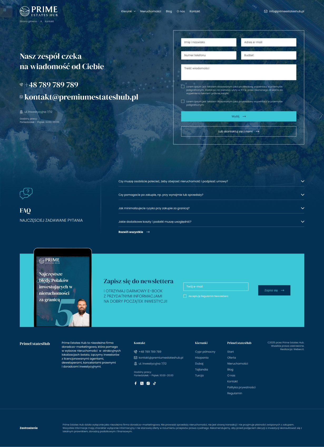
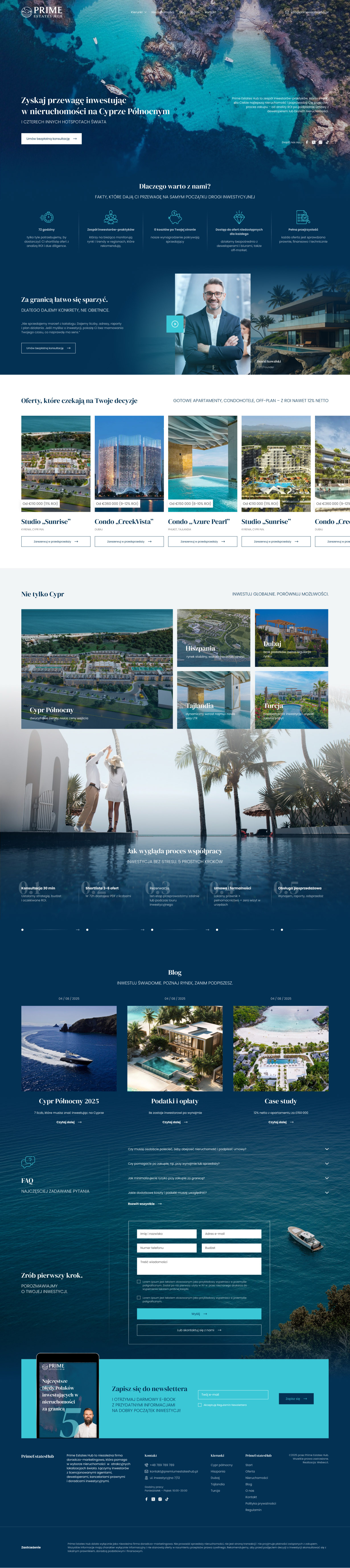
designed to feel spacious, calm and considered.

Swipe inside the screen to explore the full page.

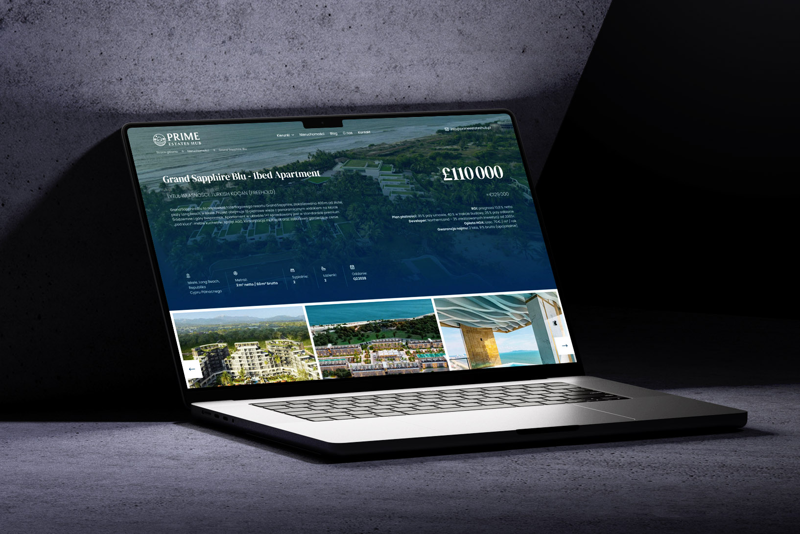
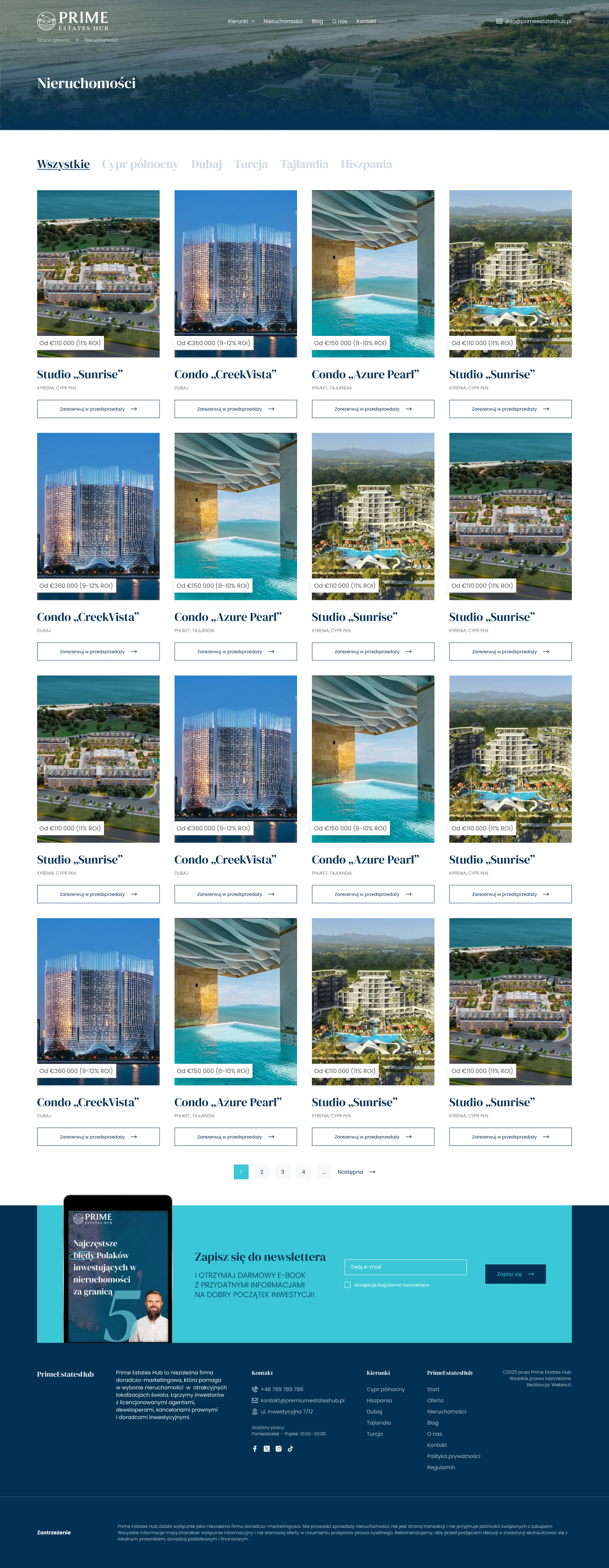
One system, different investment stories.

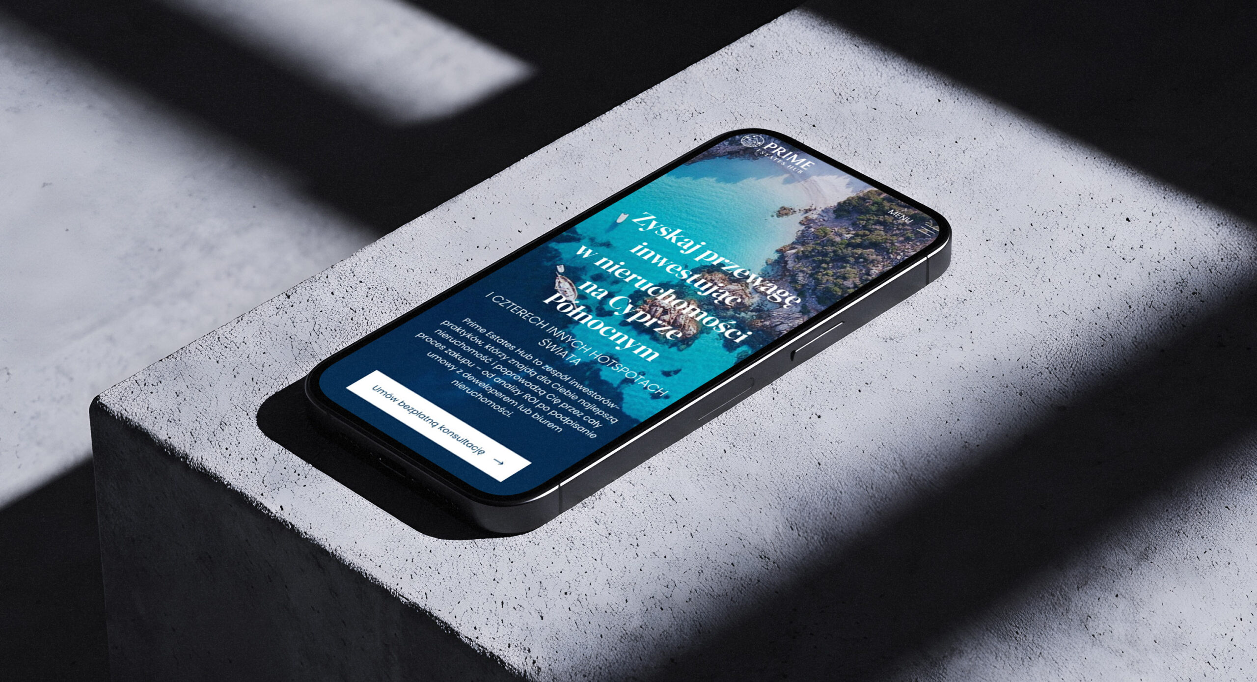
The same premium language, adapted to a smaller screen.

Swipe inside the screen to explore the full page.

Role
Art direction · UI/UX design
Collaboration
webeo.it
Client involvement
3 online design meetings
Process
Research · Competitive analysis · Art direction · UI/UX design · Client presentations

Other case studies